
Simon & Gloria
Turning a generic jewelry site into a luxury boutique experience, that feels exclusive yet wearable every day
A full-service UX redesign and visual refresh focused on improving trust, simplifying the shopping experience, and strengthening the brand’s presence within a competitive market.
The Challenge
Simon & Gloria is a vintage jewelry and custom engagement ring brand rooted in timeless, expressive design. As the brand evolved, its Squarespace website became limiting and no longer reflected the craftsmanship, personalization, and emotional value of their high-end offerings.
The challenge was to create a distinct branded experience that strengthened the UX while maintaining authenticity within the jewelry space.
Our Approach
Step 1: We began with a competitive analysis of similar brands in the jewelry market alongside a UX audit to identify friction points and opportunities for growth.
Step 2: From there, we explored four distinct brand worlds through moodboards to define positioning and establish a clear visual identity.
Step 3: We then designed and iterated key user flows through wireframes and high-fidelity mockups, before deploying the experience and refining it based on performance and business goals.
Video Demo
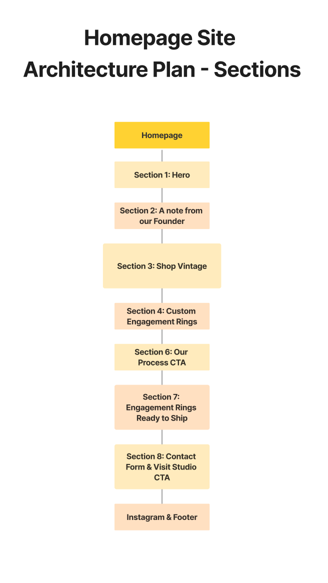
Site Architechture
We began by restructuring the site navigation and key pages to establish a clearer site architecture and improve overall usability. The goal was to streamline the user journey so key actions could be completed within a maximum of three clicks.

Branding
Client Inspo Images


My Work - Brand Themes
Original Client Branding:

New Branding:
We decided to go with the French cafe theme as that fit best within our key brand words: timeless elegance, luxury for everyday, & romantic

Branding Identity:
Solidifing Colour Scheme, Font, & Visual Style


Branding Finalized:
Drawing inspiration from authentic imagery of iconic French cafés and bakeries, we developed a palette that feels warm, rich, and lived-in. Evoking the atmosphere of quiet moments within the high-energy Parisian streets.
We explored key tactile textures to bring depth and authenticity to the visual system, including gingham tablecloths and vintage newspaper print. Supporting elements such as napkins and postcards were also introduced to further enhance the storytelling and atmosphere of the brand.
Competitive Analysis
Gaps Identified:
-
Many brands felt interchangeable
-
Minimalism lacked memorability
-
Strong branding often came at the expense of intuitive navigation
If we combined Whitelaw Gold’s brand memorability with the intuitive navigation of larger retailers, we could create a premium yet user-friendly experience.
Common Market Patterns Observed:
-
Clean, editorial layouts
-
Neutral palettes
-
Gallery-style product displays
-
Corporate tone
Brands reviewed included:
-
Mejuri
-
Club Monaco
-
Whitelaw Gold